Although there are several fairly common ways to graphically display
descriptive statistics we will primarily focus on two:
- The Histogram
or the Bar Graph
- Stem and Leaf Plot
Example
Let’s go over an example of how to create a bar graph. To begin with let’s look at this blank graph seen below:
The bottom line on a graph is often referred to as the x axis and
the vertical line to the left is called the y axis.
We will now use the following values which represent the number
of bark beetle killed trees per acre on seven sample points from a
watershed.
98, 102, 106, 105 102, 81, 24
Let’s begin by making a bar graph with this data: On the x axis
we will label each site 1 through 7 and on the y axis we will plot
the number of bark beetle killed trees per acre.
Your graph should look like this when you are done:
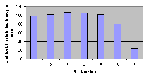
You can see that bar graphs are one way you can graphically show
your data. Bar graphs are especially useful when you want to show
data from qualitative variables. |